Tutorial
Beginner
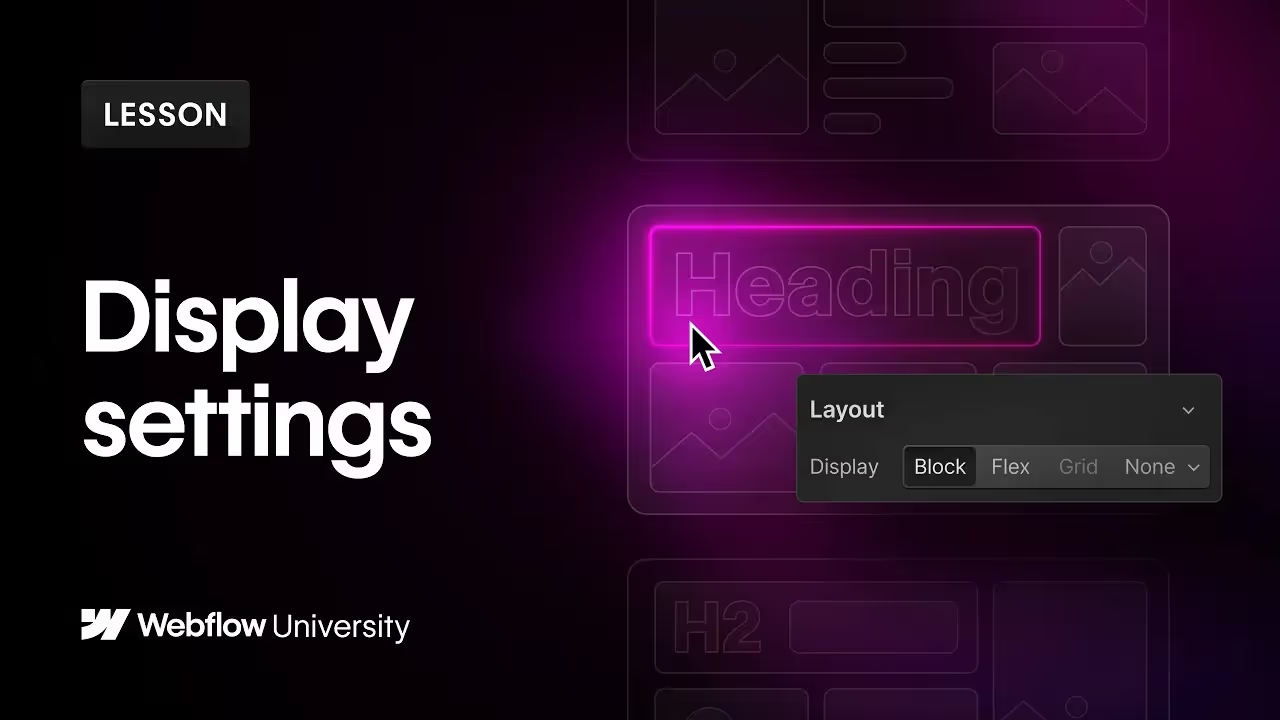
Understanding CSS Display Settings in Webflow
This Webflow tutorial explores the various CSS display settings, showing how they affect element layout and behavior. Learn the practical applications of each setting through hands-on examples within the Webflow Designer.
Summary:
The CSS display property is essential for controlling the layout behavior of elements and their content.
This tutorial is divided into five parts, covering the key display properties: Block, Flex, Grid, None, and Inline. Each section demonstrates how to use these properties in the Webflow Designer to achieve desired layouts.
- Block Elements: These stack on top of each other and occupy the full width of their parent container. Practical examples include headings and paragraphs, which wrap their content within the container's width by default.
- Flex Elements: Ideal for one-dimensional layouts, Flex (or flexbox) aligns and justifies children elements vertically or horizontally. It requires setting the display to flex on the parent element, offering extensive control over child elements' alignment and order.
- Grid Elements: Grid layouts guide children by columns and rows. You can adjust the number of columns and rows, and even nest content within grid cells using div blocks for more complex layouts.
- None Display: Elements set to display: none are hidden from the page and screen readers, effectively removing them from the layout while still retaining them in the code. This is useful for interactive elements that need to be hidden on page load or after an interaction.
- Inline Properties: Inline-block, inline-flex, and inline-grid settings allow elements to sit inline with others while still retaining properties of block, flex, or grid. This is particularly useful for specific layout needs like icon arrangements or button designs.
This tutorial also highlights the difference between display: none and setting opacity to 0%, emphasizing when to use each setting for different purposes.
Key Takeaways:
- Block Elements: Stack on top of each other, occupying full width by default.
- Flex Elements: Align and justify children elements within a parent flex container.
- Grid Elements: Guide children by columns and rows, allowing for nested content.
- None Display: Hides elements from the page and screen readers but retains them in the code.
- Inline Properties: Combine inline and block/flex/grid properties for versatile layouts.
Tags:


