Auto-Hide Nav Bars for a Cleaner Design
Make your website's navigation smarter by creating a navigation bar that hides on scroll down and reappears on scroll up, keeping content in focus while maintaining easy access to navigation.
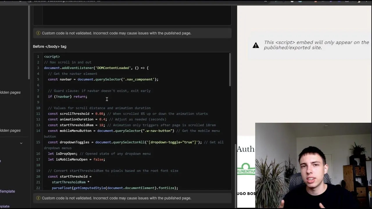
This video from Simon Lampert offers a detailed guide to implementing a dynamic navigation bar in Webflow, using a custom JavaScript solution. Unlike the traditional method of using Webflow's native page interactions, this approach allows for greater flexibility and scalability. The solution includes safety measures for pages without a navigation bar and accommodates complex menus like mega or mobile menus that need to remain visible during interaction. The tutorial provides a step-by-step walkthrough of the JavaScript code, explaining how it works, and how you can customize parameters such as scroll thresholds, animation duration, and easing effects.
Key Takeaways:
- Custom Code Advantage: Use JavaScript for a more flexible, scalable solution than Webflow's native interactions.
- Responsive Design: The nav bar remains functional with dropdowns and mobile menus.
- User Experience: Hides the nav bar on scroll down to maximize content view and reappears on scroll up for easy navigation.
- Customization: Adjust scroll thresholds, animation duration, and easing for personalized effects.
- Safety Measures: The code includes checks to ensure it runs smoothly even if certain elements are missing from the page.


